The Model for Improvement is a widely used framework for driving measurable, sustainable change in healthcare. It blends three fundamental questions with a structured testing method to accelerate progress. These questions—What are we trying to accomplish? How will we know that a change is an improvement? What change can we make that will result in improvement?—help teams set clear aims, identify meaningful measures, and select targeted interventions [1]. The model is intentionally flexible, allowing it to integrate with other change approaches, and emphasizes iterative learning so that teams can refine strategies based on real-world feedback before scaling them across systems.
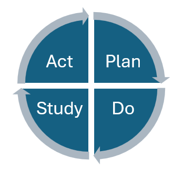
At the core of the Model for Improvement is the Plan-Do-Study-Act (PDSA) cycle, a rapid, iterative process for testing changes on a small scale before broader implementation. In the Plan phase, teams define the objective, make predictions, and outline the steps and data collection methods. The Do phase involves carrying out the plan and documenting observations. In the Study phase, results are analyzed and compared to predictions, with lessons captured. Finally, in the Act phase, teams decide whether to adapt, adopt, or abandon the change before moving into the next cycle.[1] This approach minimizes risk, builds confidence in the change, and supports continuous learning. Teams can document and track their tests using the PDSA Worksheet from the Institute for Healthcare Improvement , which provides a structured template for recording objectives, actions, and outcomes for each cycle.
Effective quality improvement relies on using the right types of data in the right way. The most impactful QI initiatives draw from a balanced “family of measures” that includes outcome measures (what ultimately matters to patients), process measures (whether the steps that drive outcomes are being performed reliably), and balancing measures (to detect unintended consequences of changes) [2]. Both quantitative data—like run charts and control charts—and qualitative data—such as patient feedback or staff observations—are essential for understanding performance and guiding decisions. Collecting small amounts of data frequently, rather than large datasets infrequently, allows teams to detect trends quickly and adjust interventions in near real time, making improvement efforts more agile and effective.
Additionally, Quality Improvement Collaboratives (QICs), such as the one used on the Regional QI Hub project, are a proven strategy for improving health care and population outcomes.[3] Results suggest that partnerships and alliances with a range of key stakeholders is critical beyond just data infrastructure; they also promote initial participation and engage institutional champions.[4]
1 https://www.ihi.org/library/tools/plan-do-study-act-pdsa-worksheet
2 Using data for improvement | The BMJ
3 Are quality improvement collaboratives effective? A systematic review | The BMJ
4 Designing Quality Improvement Collaboratives for Dissemination: Lessons from a Multiple Case Study of the Implementation of Obstetric Emergency Safety Bundles | Journal on Quality and Patient Safety
Quality Improvement Glossary
A problem-solving technique used in quality improvement that involves asking “why” five times to identify the root cause of a problem.
Measures the unintentional and undesired impact on a different part of the system being improved. An example of a balancing measure is the rate of staff skin breakdowns in a project focused on improving hand hygiene compliance.
Also known as a fishbone diagram, this visual tool is used to identify and organize the many possible potential causes of a specific problem.
A graph displaying data over time that helps improvement teams identify how a process is performing over time.
A control chart has dashed or dotted lines called “control limits” that show if changes or variability in a process are predictable or unusual. If data points fall outside these lines, it means something unexpected may be happening. Statistically the control limits are three standard deviations from the mean in either direction.
The center line value of a segment or entire dataset in a control chart describes the average value of that dataset.
A visual representation of the steps of a process, system, or workflow in sequential order. They help identify critical process steps, eliminate wasteful steps, and improve processes.
When we tend to explain behavior by permanent, enduring traits that would be better explained by circumstances and context. Observers tend to overattribute the behaviors of others to their personality and under-attribute them to the situation or context. This leads to misinterpreting potential causality.
A written statement that outlines the overall objectives and improvements intended for an organization or project. Considered the broader change being pursued, which often requires multiple quality improvement projects.
A visual diagram of the basics steps of a process and used for highlighting or pointing to the greatest problems and/or opportunities.
A type of bar graph that visually displays the frequency and distribution of data.
A visual tool that shows how a team plans to reach an improvement goal. It maps out the main factors (called primary drivers) that directly influence success, the supporting factors (called secondary drivers) that help those main factors work, and the specific ideas (interventions) the team will try to improve those drivers. It serves as a communication tool and a depiction of the improvement change theory.
Measures the final product/results and assesses the performance of a process or system. An example of an outcome measure could be the rate of adverse events caused by poor hand hygiene practices. Generally, this is the measure of most interest to patients and providers.
A bar chart with a cumulative line showing which problems happen most frequently. Helps teams focus on change that will make the biggest difference.
A structured trial of change which includes four phases: plan, do, study, and act. The PDSA cycle will naturally lead to the “plan” component of a subsequent cycle.
A set of thematically related, repeated PDSA cycles. The goal of a PDSA ramp is to build with each cycle from testing and refining to implementing the strategy and sustaining change.
Measures the improvement activity performed. An example of a process measure is handwashing compliance rates. Generally, these are measures most improvement teams are concerned with early in the improvement effort. The theory is that improvement on multiple process measures will contribute to improvement of the outcome measure.
Typically, a senior leader or manager who can sponsor, endorse, and advocate for QI projects. They provide resources, remove barriers, and communicate the project vision and goals to other stakeholders.
QI is a formal approach to the analysis of performance and systematic efforts to improve it. There are various methods or models of QI such as total quality management (TQM), continuous quality improvement (CQI), Six Sigma, LEAN, and more. All QI models are aimed at improving performance. In health care, improving performance can result in a reduction of medical errors, morbidity and mortality, and improved quality of life for patients and communities.
a simple, structured way to make health care (or any process) better. It helps teams test changes in real time and see what actually works. It’s built around three key questions and a testing method called PDSA cycles.
- What are we trying to accomplish?
- How will we know a change is an improvement?
- What changes can we make that will lead to improvement?
Tool used to clarify team roles and responsibilities across tasks. Assigning roles for each task allows for better communication and enhanced clarity across the project.
A structured process for identifying why a problem happened.
Graphs displaying data over time that help improvement teams understand how a process is performing.Median: The center line of a dataset in a run chart that describes the middle value of the dataset.
Also known as a scatterplot, it visualizes quality in datasets by identifying patterns between two variables. Used to identify cause-and-effect relationships.
A method to identify process failures and determine potential tests of change. Can also be used for designing processes to identify possible problems before they happen and plan how to prevent them.
A way to set goals that are clear and doable. It helps teams stay focused and make real progress, especially in healthcare quality improvement. The word SMART stands for:
- Specific: Be clear about exactly what you want to improve.
- Measurable: Choose something you can track with numbers or data.
- Achievable: Set a goal that’s realistic with the resources you have.
- Relevant: Make sure the goal matters for your project and audience.
- Time-bound: Give yourself a deadline or time frame to accomplish it.
Describes differences in performance outcomes within a process. Often this is depicted over time in a control chart. In QI, process variation usually emerges through individual practice preferences, equipment, supplies, environment, measurement, and management practices. The decrease of variation is considered an improvement in QI.
- Common Cause Variation: Causes inherent in the process and are expected.
- Special Cause Variation: Causes not inherent in the process but arise because of specific circumstances.